Showing posts with label Royal. Show all posts

Saturday, June 16, 2012

Royal Typewriter Rescue and Another Special Typeface

The Royal portable typewriter on the left in the photo below is a recent rescue from ebay.  I was happy to liberate it from the clutches of a key chopper (evidenced by a bid history on typewriters and craft supplies).

There is one obvious problem:  this machine is hammered.  It appears to have spent the last 50 years or so in a barn or attic with no cover.  The seller even commented that he had done an initial cleaning.  Every part that can be dried out is.  The paint is scuffed, chipped, oxidized and crazed.  At this point, you may be wondering why on earth I bought this beater.  Am I really so crazed about key choppers that I would rescue junk?

As the title implies, you will need to read on for the answer.


The typewriter on the right goes by the name of "Keylime".  She will remain a mystery until a future post.  However, a side-by-side view gives you a pretty good idea of how far gone this poor red Royal is.

Kissing cousins, as if anyone would want to kiss a derelict.

As seen below, this rescue was not entirely altruistic.  Actually, it possesses a typeface that is my one of my "white whales".  It is an obsession among obsessions.

This typeface appears to be identical to that of a Royal Aristocrat shown on the Cambridge Typewriter Company blog.  Tom Furrier identified it as "Moderne Pica Block, Ra 280" by Alfred Ransmeyer &  Albert Rodian Vereinigte Typenfabriken, Berlin.  I have reason to believe this is actually the common variation of the rare Vogue typeface available for the 1930 variation of the Royal portable.  More on that subject in a later post.


Is this Vogue by another name?

This poor machine has seen better days.  I have yet to take it apart to assess whether it can be repaired as is.  If not, the type bar assembly will become the subject of a transplant operation to another Royal.  For what it is worth, the other residents in the House Full of Nerds think it is beautiful and see its potential.  I'll give repair an honest try or perhaps combine it with another parts machine if necessary.

What do you think?  How far should I go to bring this basket case back to good health?  I am out on travel at the moment, so comment moderation will be delayed.  Rest assured, they will appear in the near future!

Wednesday, May 9, 2012

A Preview of Coming Attractions


So cryptic this photo is.  Mmmm...  Something to do with Richard Polt's flames it might have.  You seek Godzilla.  Yes.  Godzilla - a powerful copy editor is he!

Mwa, ha, ha.

What could this mad Blogger be thinking?

Tuesday, May 1, 2012

Royal Hartford Typewriter Factory Photo Resurection

I finally pulled the photo of the Royal Typewriter factory final adjustment room out of its frame and gave it a proper scan.  The driver software for the Epson 3170 has some nice restoration tools built in.  This is a 16-bit grey scale scan with a touch of unsharp mask.  The built in color restoration function did the rest.
The original post with additional information about the factory and the photographed and unadjusted image is at http://vintagetechobsessions.blogspot.com/2012/04/royal-hartford-adjustment-department.html

If you missed it the first time around, this will give you a good idea of how well this print has weathered the last 90+ years.
Photographed in the frame.  How's that for digital magic?

I've added a "Download Zone" to my Fotki site.  Feel free to grab a digital copy at
http://public.fotki.com/coyotesareus/download-zone/technology/

The image comes in file sizes ranging from relatively easy to download to high resolution.  The latter should blow up nicely to just about any size you want.  I'm thinking this would look good on Adorama's black and white paper at poster size.

Lucky me:  Kansas City hosts one of 13 National Archives for Federal archival records.  This Saturday, they are putting on a full day "Preservation Matters" workshop on archival and preservation techniques for photographs, ephemera and household heirlooms.  I'll probably find out that I have done everything wrong, but I am still looking forward to learning more.

Wednesday, April 4, 2012

Royal Hartford Adjustment Department Circa 1908


Last month a box appeared on our doorstep bearing a gift from a friend.  These photos are taken from a print she picked up many years ago when she lived in the Kansas City area.  It is pretty beat up and the emulsion is doing weird things after 100 years.  But it is still 10 times awesome!


 I am reluctant to take this original print out of the frame given its condition.  Please ignore the reflections.

According to Royal company history, this photo was taken the year the Hartford manufacturing facility started up.  I've looked closely at the machine on the bench and can find no model number identifier.  Was this before they called the No. 1 by that name?

I looked up the studio and found more by the same photographer on a Connecticut history website.
Connecticutt History Online: John C. Nyser  MEK was nerding out on the photo of the book  keeping and penmanship class at the YMCA.

Do a search for Royal Typewriter on the website and you will be rewarded with photos of the factory and the Royal Typewriter Fife and Drum Corps.  Really. Royal Typewriter Company photos


 My photo would probably have been taken on an 8x10 plate.  The print is most likely like a contact sheet and holds a lot of detail.  For you serial number geeks, take a look at the covers.  I can make out one that says 16,541 which would be consistent with a 1907 manufacture date as shown on the Typewriter Serial Number Database.

This was a brand new facility and this portion looks like a pretty decent place to work.

I'll pull this out of the frame and do a proper copy before it falls apart.  This print is a great background for the work bench.  Typewriter and technology ephemera doesn't get much better than this! 

Royal Week at vintagetechobsessions continues through the weekend with a special typewriter waiting in the wings.  Thanks for reading!

Saturday, January 21, 2012

Something Different: A Royal Portable in Chrome and Woodgrain

Today I have something pretty special to share with the Typosphere.  I've scoured the Interweb high and low with nary a trace to be found of this color scheme.  I've seen silver plated Coronas in a couple of places.  There is also the nearly mythical gold plated Royal of Ian Fleming fame.  I am aware of chromed Olivers designed for tropical duty.  The Typosphere is also populated with fine examples of aluminum body typewriters stripped and polished.

And I finally found a close cousin of this Royal Portable!  I should have checked Robert Messenger's Museum blog first given his vast and beautiful array of typewriters.   His machine appears to be a second generation Portable dressed head to toe in shiny chrome.  Gorgeous!
http://oztypewriter.blogspot.com/2011/03/prince-in-shining-armour-right-regal.html

Before I get carried away, I invite any of you possessing a chrome and  wood grain Royal to step forward lest I totally embarrass myself.  I think this is a fairly unique machine.  Even if it is not, there will now be a digital record with plenty of photos.

Oooo.... shiny!

Here is the chrome and wood grain Royal Portable looking shiny and clean.  For the record, I don't smoke, but the lighter seemed to fit the scene.  So would a .38 Special and a tumbler full of Scotch on the rocks.
This Royal Portable came to me by way of ebay a couple of months ago.  I finally got around to cleaning it on a freak warm January day.  The seller was located in New Jersey and I was unable to get a back story on the machine.  It wasn't dirt cheap, but it cost just a smidge more than the average black machine of the era.  I was the only bidder.
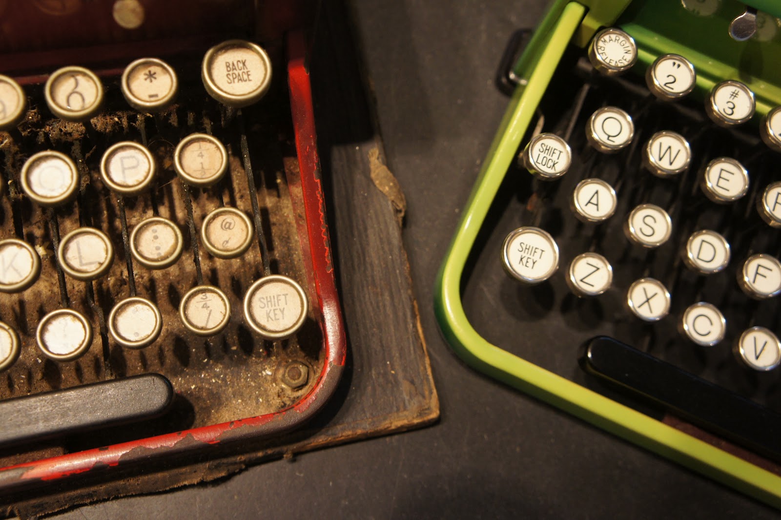
This is a first generation Royal Portable as indicated by the exposed ribbon spools.  The chrome is high quality and in really great shape with only a few tiny rust pits.  Not bad after 83 years!
According to the Typewriter Serial Number Database, my Royal was manufactured in 1929.  Based on the overwhelming and toxic mold/mildew smell, it would appear that much of its life was spent in a basement.
Egregiously reflective chrome typewriter porn shot.
Under normal circumstances, I would not bathe a rare machine.  In this case I had no choice.  The chrome shell smelled toxic even after removing it for hand washing.  So into the sink the chassis went with a mixture of ionic and non-ionic surfactants.  I was reluctant to take this step after having a mixed outcome with the sans serif Everest K2.

I kept the keys above water for the immersion bath (2 wash + 2 rinse cycles).  The prior owner of long ago was rightly proud and appears to have displayed it prominently in a house full of cats.  Even after dry brushing, the wash water was beyond disgusting with fur, dirt, old oil and pencil and eraser shavings.

The one advantage to basement storage is that the rubber rollers are still flexible.  Excess humidity is good for something!

The case, I am reasonably sure, is beyond salvaging and will need to be burned.  It is in great condition, but the smell...oh, my!  Perhaps a friendly key chopper will have an extra case I can pick up on Etsy or Ebay.
I hand washed and waxed around the two decals on back.  After looking at many photos online, I was surprised to see little rhyme or reason to Royal decal placement.  Some machines have decals on front and some don't.

This is a generic Royal type face with markings identical to those on a Royal De Luxe from a decade later.  My lovely macro lens brings out the best and the worst.  I really need to hit the type slugs with mineral spirits.
Since I am unable to find evidence of the existence of similar Royal Portables, this one is something of a mystery to me.  We love the color combination (or lack thereof)!  Having grown up in the 70s in the back of a family Ford station wagon with peeling wood grain flapping in the wind, I am not normally a fan of that particular look.  However, the paint work is well done and quite durable as evidenced by my washing experience.
Yes, it is time for a photo overdose.  This machine looks great from just about any angle.

I wish manufacturers had not quit doing raised decoration on the paper tables.  The whitish smudge was already in the finish and didn't change with washing.  I have not yet decided which wax to try on the painted surfaces.
Please help solve the mystery of the chromed Royal.
Hooray!  The scanner is no longer on strike, so here is the type sample.

This machine types pretty well but it is loud and not well suited to late night typing.  The key feel is a bit heavier than the Triumph of the same era, but it should loosen up with a bit of exercise.

I look forward to your comments and speculations. 


Friday, November 25, 2011

Mousiest Royal Futura - Except for the Awesome Font


Early morning sun brings out the best in this color combination.

The subject today is the world's mousiest looking Royal Futura 800,  We're not talking a little bit mousy - we're looking at full gray on gray.  I suppose at some point it must have been a cool combination since this seems to be the most common.

You push the logo to pop the hood.  Pretty neat and not at all gray.
 Um, yeah.  Even with the cool red logo button action, this is still one of the most boring looking typewriters in the world.

That is until you find out what is lurking under the hood.

Mmmm, tasty.


Pretty spiffy, huh?  This is Royal's version of cursive.  It is looser and more informal looking than the Hermes variation.  It is perhaps a little closer to my casual writing, but much more legible.

Funny:  Just now the gingercat (Claire) just looked over my shoulder and noted that the type slug caption sounded like something a key chopper would say.  I prefer to think of is as the sound of a type face connoisseur.

But perhaps we should let the Royal do a proper introduction:


As much as we love the Royal Futura, it doesn't have the precision of an Olympia.  The fit and finish are to a noticeably lower standard.  However, it's still a nice typing machine and is just generally more laid back.  It is almost quiet enough for night typing unlike the staccato Olympia SM3s.  The Futura is more beach bum than jet set executive.

The Futura has a whole different look.  At the moment, they are not particularly popular.  Hard telling whether that will change or not given the myriad options for used typewriters.  I've heard Futuras have shown up on TV.  I wouldn't know since we watch the Olympics, Presidential addresses and weather alerts and that's about it.

Gray to awesome, or leave it as is?

We're thinking about maybe doing a little repainting action.  So what do you think?  Leave it as is or go crazy with some hammertone?  There are so many luscious colors at Home Depot...


Wednesday, November 16, 2011

Dead Blogs Are No Fun

This sheet was cut from a blank book for documenting awesome dinner parties.

We've all been through it:   the Eureka moment when we have chosen to blog, know what we want to blog about and have an awesome name in mind.

Excited, we jump on Google and look up Blogspot names.  Perhaps we already have a blog and just want to add another to fit a different theme.

Then we find out that all the good names are taken.  That's not so bad unless they are taken by name squatters.

That is precisely what happened to me.  I wanted a place to put my odd stuff that did not match the vintage technology theme.  I started looking up names and found roughly 8 in 10 of the good ones (even obscure second choices) being squatted on and filled with blank page, one post, no posts or even a couple of months worth of posts many years ago - as in 2002 or 2004 in a couple I looked at.

And then I had a Eureka moment and discovered that deadblogsarenofun.blogspot.com had not been claimed.

It is now and I would love to have some help in identifying blogger names that are being used to no good end.  Send them to me and visit the new blog and let's have some fun!

http://deadblogsarenofun.blogspot.com/

As  side note, I have to say that I had a really good run up until looking for photo related blog names.  I've been surprised at snaring good names in the last few months for me and the family including:  nerdtopics (Claire), thoughtsatfullspeed (Hannah), housefullofnerds (my Spousal Unit) and my new junk pile called digitalmemoryhole.

The latter is currently an empty shell, but I promise to populate it, really.