Showing posts with label sans serif. Show all posts

Monday, January 18, 2016

IBM Electromatic Sighting

I had to share this beast seen in the wilds of an antique mall. Other than a stuck "z", it appears to work fine and badly needs a new power cord. It wheezes and chugs and smells vaguely of ozone with its open armature motor design. Unfortunately, I could not find a serial number to accurately date it.


The typeface is a simplified sans in all caps. It didn't appear to be a Ham mill. Such an interesting machine, but I have no space for it.


I keep seeing silly descriptions for old machines. They are all steampunk. I would be interested in seeing this with all of the sheet metal removed. Below is the closest thing I could find to a serial number. The motor was serviced in the 1950s. Again, such an interesting critter. Must resist...


Tuesday, November 6, 2012

A Typogram Received! Election Avoidance on the Blog of the Beast

It's election night.  I am a serious political junkie and need a temporary distraction.  I have interrupted my MSN, CNN, Politico, Wonkette and Twitter feeds to bring forth a wondrous Typogram received from Ryan Adney of Magic Margin!

Behold, the envelope!  Yes, Ryan used his Royal Navy "radio mill" for the envelope.  As a typeface junkie, I very much appreciate this kind gesture.


The hand drawn desert landscape reminds me of warm, sunny places.  I love the actinic  glare of the Valley of the Sun.

This great greeting card was inserted in the envelope.  What a great graphic!


The real prize was tucked inside.  This postcard is pretty much awesome. Repeat after me... we must worship the Sholes.  It is mightier than mountains and cranks out words more potent than edged weapons.  Besides, according to Robert Messenger, Mark Twain got pretty ornery about the Sholes' offspring.


Ryan, thanks for the spiffy Typogram.  Thanks also to  Anna of A Machine for the End of the World for creating The International Correspondence Initiative. 

Here is the back of the postcard, also by way of the Royal Navy mill.  Sweet.


As for my oblique reference to the "Blog of the Beast", I was referring to the page count as it appeared when I opened my Blogger dashboard:  24,666.  Given that it is election night, there is a certain irony in the fact that my pageviews are equal to the last digits of a zip code in Topeka, Kansas.  This nearby hamlet is home to our state capitol and the infamous Fred Phelps of the Westboro Baptist Church.

So, from election avoidance central, I wish you all a pleasant evening.

Saturday, August 11, 2012

Ephemeral Chicago Circa 1942


Keylime has a a NOS Silk-Spun brand silk ribbon and is now a crisp and happy camper.


I'm sorry to have missed the era of streamlined trains.

Today, the trains may look newer, but there is little difference in the appearance of the Lake and Wells line crossing.

Two of my favorite buildings:  The Wrigley and the Tribune.  The Wrigley features white terra cotta tile.

Deco style doesn't get much better than this.  So optimistic!
Back cover.  Chicago has pretty much anything a tourist could possibly want.

Saturday, June 23, 2012

Happy Typewriter Day from Keylime, the Vogue Royal


I hereby interrupt the vacation typecast series to bring you a greeting from the newest member of the Vintage Technology Obsessions typing stable.  Vintage Technology Obsessions will return to regularly scheduled posts after Typewriter Day.

That would be "exercise" that Keylime needed.  At least I spelled derelict right the first time.  Spell check has ruined me.

You might remember this mystery machine from the recent post on the 
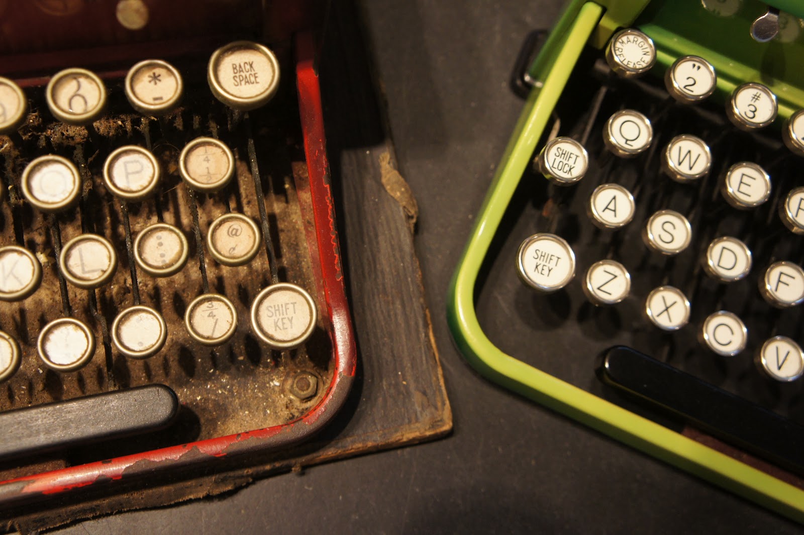
derelict red Royal I saved from a key chopper on ebay.  It has the Vogue typeface, but is many hours of repairs away from being useful for actual typing.  I found Keylime first and happened upon old Red several weeks later.


It only took us a few minutes to determine the appropriate name for this machine.  She came from Florida and reportedly belonged to the spouse of a former president of a state university.  The color balance in these photos is pretty accurate.  This is one upbeat and perky little typewriter!  She is sweet and tart like a slice of keylime pie.


As I noted in Old Red's post, finding a Vogue Royal was an eight month obsessional journey for me.  I don't regret the search.  However, like any junkie, I have experienced a bit of a letdown having procured my fix.  Now I will happily type away until I find a Graphika or something with a fractur typeface.

As for may statement regarding interesting typewriters showing up in threes, I will provide a few examples.  All of these showed up in one to two week clusters, some have just disappeared even in common form:

Olympia SM3:  Three machines with the italic typeface and fairly clear photos.
Facit:  Three portables of various descriptions with the cursive typeface.
Royal Portable:  Three machines ranging from Futura to Safari models with the obscure cursive typeface.
Erika:  There was a week where almost ten model 5 machines appeared.  This is the week I scored an incredibly rare Erika M while no one was paying attention.  Well, that is more than three.


This typewriter had a bit of a premium attached, but it was in line with the prevailing prices of similar second generation Royal portables with average typefaces.  Having come from Florida, I was pleasantly surprised that Keylime had no funky odors (unlike Margo, the gold Royal QDL from Florida).  All I did was a basic clean and lube and here she is!  The type bars were clean prior to adding a cheap Office Max ribbon.  She really deserves an NOS silk ribbon if anyone has one available.

By the time this post goes live, the big Kansas City weekend of Maker Faire and Art of the Car will be well underway.  I am looking forward to geeking out on technology old and new.  I am not looking forward to the 100+ degree weather expected on Sunday.

With that, I will leave you with a closeup of this luscious typeface.


Saturday, June 16, 2012

Royal Typewriter Rescue and Another Special Typeface

The Royal portable typewriter on the left in the photo below is a recent rescue from ebay.  I was happy to liberate it from the clutches of a key chopper (evidenced by a bid history on typewriters and craft supplies).

There is one obvious problem:  this machine is hammered.  It appears to have spent the last 50 years or so in a barn or attic with no cover.  The seller even commented that he had done an initial cleaning.  Every part that can be dried out is.  The paint is scuffed, chipped, oxidized and crazed.  At this point, you may be wondering why on earth I bought this beater.  Am I really so crazed about key choppers that I would rescue junk?

As the title implies, you will need to read on for the answer.


The typewriter on the right goes by the name of "Keylime".  She will remain a mystery until a future post.  However, a side-by-side view gives you a pretty good idea of how far gone this poor red Royal is.

Kissing cousins, as if anyone would want to kiss a derelict.

As seen below, this rescue was not entirely altruistic.  Actually, it possesses a typeface that is my one of my "white whales".  It is an obsession among obsessions.

This typeface appears to be identical to that of a Royal Aristocrat shown on the Cambridge Typewriter Company blog.  Tom Furrier identified it as "Moderne Pica Block, Ra 280" by Alfred Ransmeyer &  Albert Rodian Vereinigte Typenfabriken, Berlin.  I have reason to believe this is actually the common variation of the rare Vogue typeface available for the 1930 variation of the Royal portable.  More on that subject in a later post.


Is this Vogue by another name?

This poor machine has seen better days.  I have yet to take it apart to assess whether it can be repaired as is.  If not, the type bar assembly will become the subject of a transplant operation to another Royal.  For what it is worth, the other residents in the House Full of Nerds think it is beautiful and see its potential.  I'll give repair an honest try or perhaps combine it with another parts machine if necessary.

What do you think?  How far should I go to bring this basket case back to good health?  I am out on travel at the moment, so comment moderation will be delayed.  Rest assured, they will appear in the near future!

Tuesday, June 12, 2012

Zombies on the Streets of Kansas City

By the way, it appears they want your typewriters.  This is a street poetry producer protecting her prize.  (Ick.  What a word combination.  It is 1:00 AM and I should really give my brain a break.  Mmm... brains....)

Stage blood by the gallon.  What wholesome family fun!
Some people take their characters very seriously.  Point a camera at them and watch the fun!

This was part of a a 15 second head to toe spasm.  Impressive.  And scary.
"Did you say something?  It's hard to hear you over all this moaning!"
Clowns.  Why did it have to be clowns?

Favorite sighting of the evening:  this zombie is contemplating a happy couple inside a mobile photo booth.
A zombie walk through throngs of art lovers is towards the top of my list for fun street shooting.  I live for content rich scenes like this.  Claire came along and loved every minute of it.  We were going to dress up and join the fun, but after laying a new living room floor I was looking a little too much like a zombie to do a good job gimping along with the crowd.  Besides, inside the pack you only see the few participants surrounding you.  I love being on this side of the lens.

All photos were shot on a Canon 60D; some with a wide zoom and most with a 50mm f1.4 or 85mm 1.8.  I am out on travel.  This post is brought to you by the magic of Blogger scheduling.  Please leave a comment after the tone and I will moderate it on my return.

Beeeep!

Tuesday, January 10, 2012

Everest K2 with a Serif Allergy


Serifs are seriously overrated in certain alternative universes.  This typeface is a total mystery.  Any ideas from the Typosphere?  Side note:  I had to photograph this because when a HP all-in-one printer/scanner runs out of black ink, it won't even let you run the scanner.  I am reminded of why printers are so cheap.  Our HP 4400 deserves a generic replacement cartridge in repayment.
The Everest K2 has a classic shape.  I purchased less for the color than the typeface.
The body shell is all aluminum as are a number of components such as the key bar guide.
So, what does the number 20 stand for in Everest land?  I looked through most of the sans serif examples in the Munk's NOMDA guide and couldn't find an exact match.  We love the egregiously long "f"!  I suppose you could make a simpler lower case "d", but there wouldn't be a whole lot left.  The "h" is very fashion forward.

The color and style this De Luxe logo remind me of early 1950s Chevy sedans.
Maybe Everest had a dislike for serifs in general.  Alright, that is a bad theory given the identical machine in Robert Messenger's possession and Adwoa's shiny, black K2.


I like the odd little details.  I can easily imagine that lever inside one of the little Fiats now cruising around American cities. 


Does anyone have a controls diagram for this machine that they can scan?

I observed in the typecast that this typewriter still has a few issues.  I can't help comparing this to my German machines including the Olympia SM3s and the freakishly smooth Torpedo 18.  I had to do a lot of filing and bending to get parts to work on this machine due to alignment problems in the key bar slots.  That gave me a chance to get to know the mechanical bits well, with some problem yet to be discovered that is keeping the carriage from moving consistently.

My general opinion is that they tried hard, but there are just some basic design and finish issues that get in the way.  It isn't as slushy as the Royal Futura 800.  The cast aluminum frame is well done.  They didn't skimp on key tension springs.  With all that going for it, various alignment issues appear to have kept this machine from having been used very much.  The type slugs were already pretty clean when I got it.

Assuming I get the carriage draw tweaked, I think it will be a decent typer for short works.  The type face is really cool and joins the unique SM3 italic iterations and the Royal script in the household typing pool.  Guess I need to buy some new ribbons!